19
sponsored children
CAMPAIGN 2021
BEFORE
33
sponsored children
CAMPAIGN 2022
AFTER
35
hours/week
data management
CAMPAIGN 2021
BEFORE
15
hours/week
data management
CAMPAIGN 2022
AFTER
Overview
Context: Kemonïk NGO fights for gender equality, non ethnic discrimination and universal education in Guatemala and Spain.
Challenge: Kemonïk was sponsoring kids with no platform to organize data or receive payments. All donors had to call, wait, get the account number and transfer the money. The NGO’s team was overwhelmed by administrative work and donors were not having a good experience.
Goals: Improve the NGO's team effectivity, increase new donors and their satisfaction.
KPIs: team effectivity, ux success, ux progress, hours per task, conversion rate, conversion by channel, donors satisfaction, donors task success.
Tools


Time/Location
1 year (2021) /
San Lucas de Tolimán (Guatemala)
Taking the time to understand the team and donors' current experience
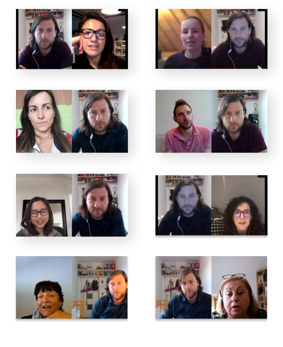
We focused on understanding the NGO’s team and the donors' current experience with 5 stakeholder interviews and 12 donor interviews. The team wanted to have a more effective ways to organize data and process payments. Donors wanted a faster and easier way to sponsor or donate. Most of the donors were also part of other organizations and talked a lot about delightful experiences with NGO’s modern sites.
Once we understood that our donors wanted a new site, amongst other things, we started analyzing different NGOs and what works for them.
Read morePresenting insights to have the team on the same page
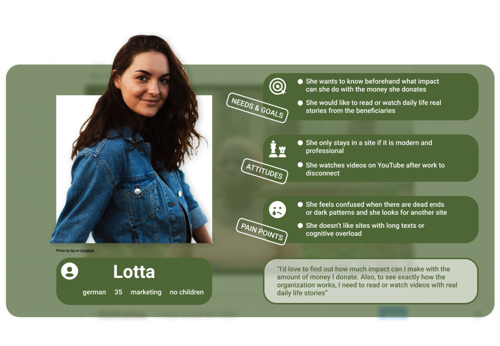
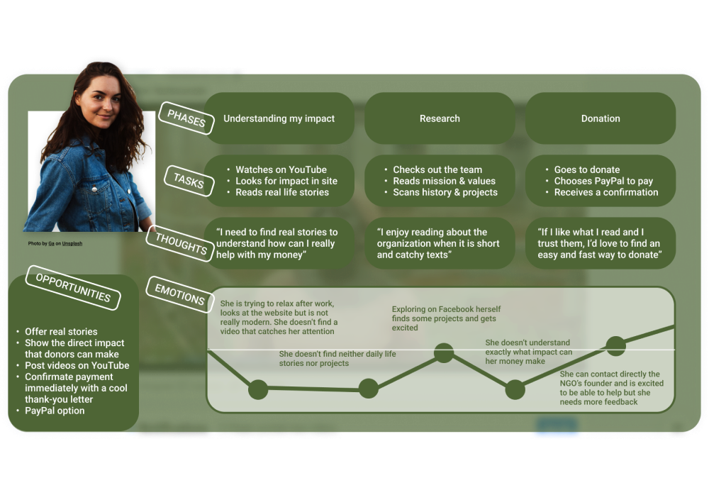
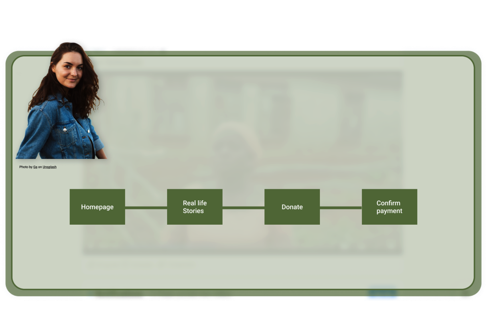
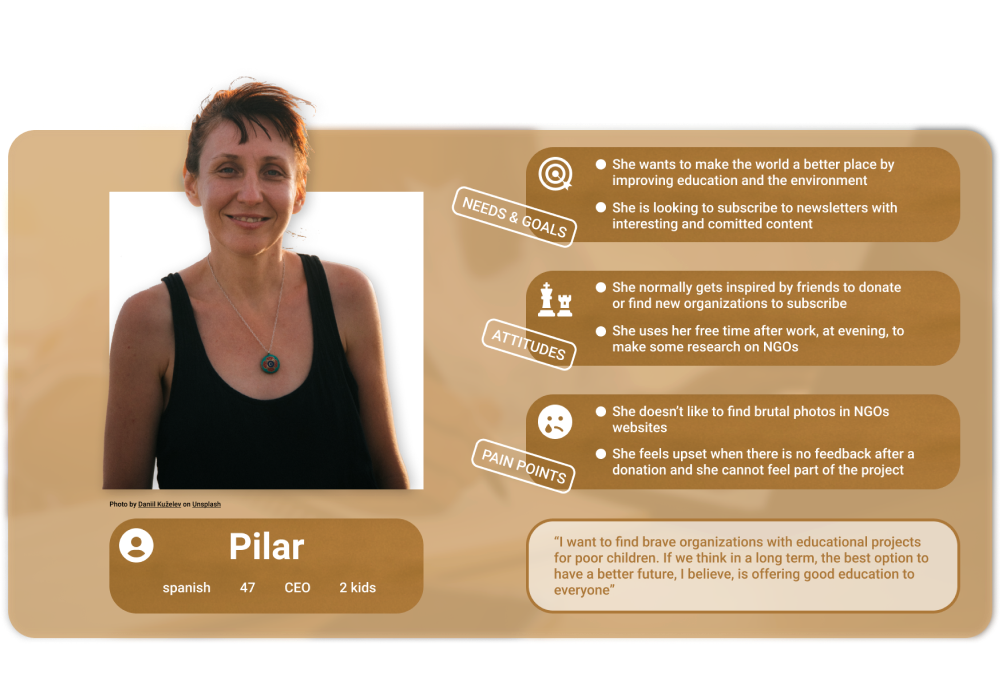
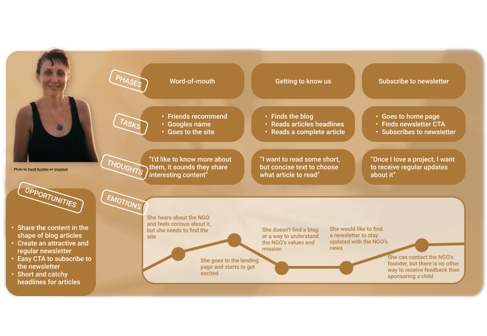
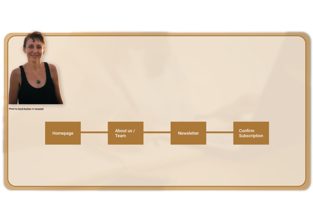
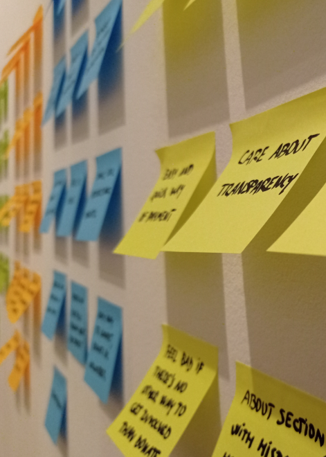
After clustering all our data we identified 4 user types and, based on that, we created 4 user personas because the team members found it easier to relate needs and pain points to a name. It was obvious that their good predisposition to personas would help us have good communication and collaboration throughout the process. After brainstorming possible solutions we focused on 2 personas: Lotta and Pilar:
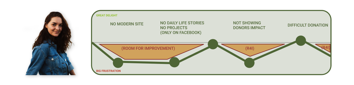
The journey is hard for our donors. Why?
-

Payments & Management
Payment process and methods are not really safe and not easy at all for the donors. Donors and donations records are hard to manage by the NGO's team
-

NGO's image
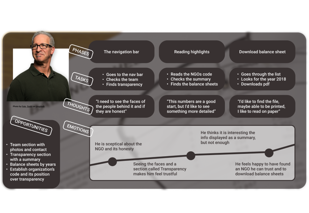
Information about the NGO is not accessible and looks outdated online, what makes potential donors don't trust the organization. They want interesting and concise information, and a comfortable way to navigate through it
-

Marketing & Communication
The NGO is not active on Social Media or creating content about the projects, and that's exactly what most of donors would appreciate, for example, with real daily life stories
How might we improve Lotta's life?
I facilitated a brainstorming workshop, the outcome of which was three solutions hypothesis, for the previous three problems, that could transform frustrations into delight during Lotta's journey to reach her goals
1.
The new website after the rebranding process would look modern, offer clear information about projects and beneficiaries stories and will be easy to accept direct donations by PayPal or credit card.
2.
Banners with detailed information about the outcome could help Lotta get an idea on the impact that her money is going to make.
3.
Finally, for the NGO's team, we realized that some of them used to work with Salesforce and concluded that integrating a CRM to the website would be much more agile for them.
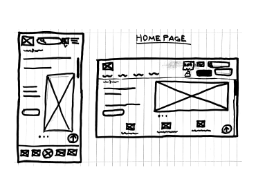
Collaboration in two projects and teams at a time
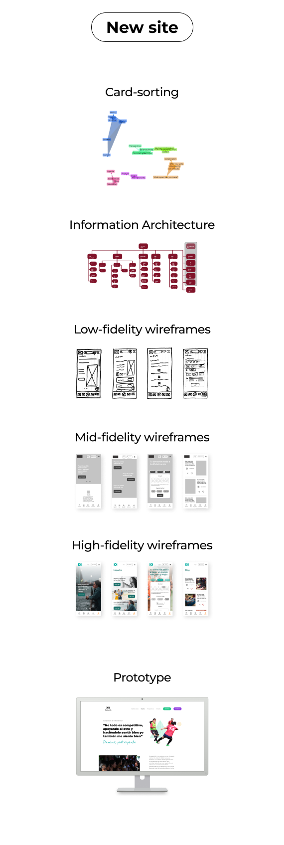
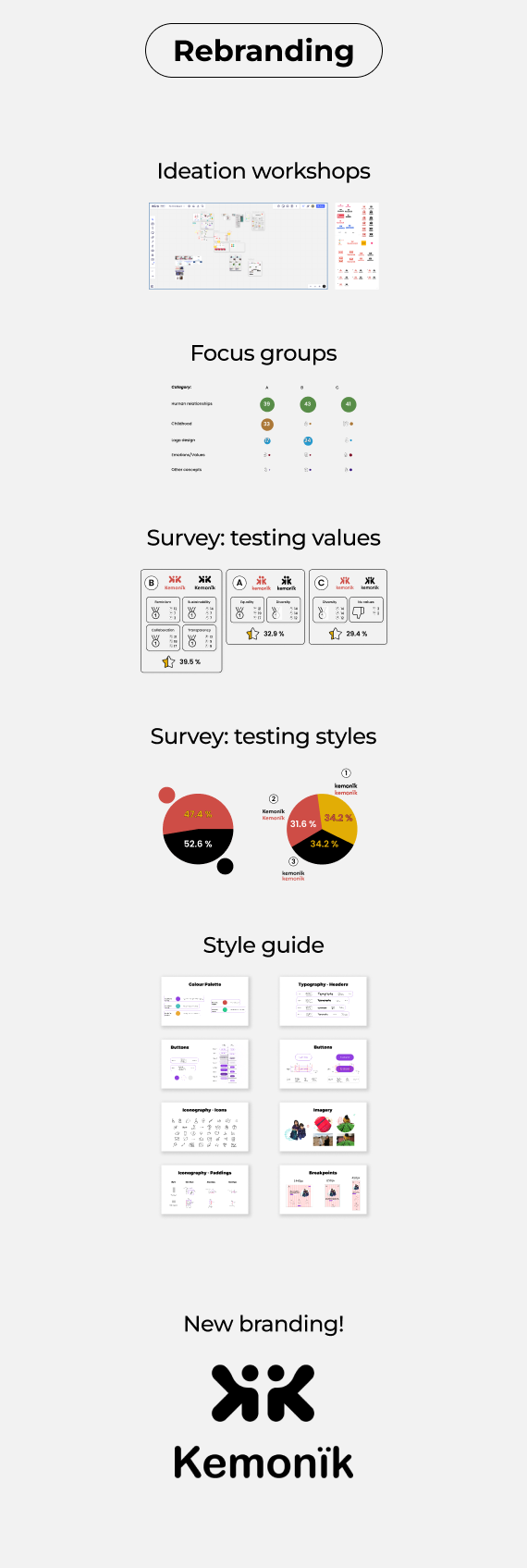
Take a quick look at our website and rebranding's solution processes performed by our cross-functional team
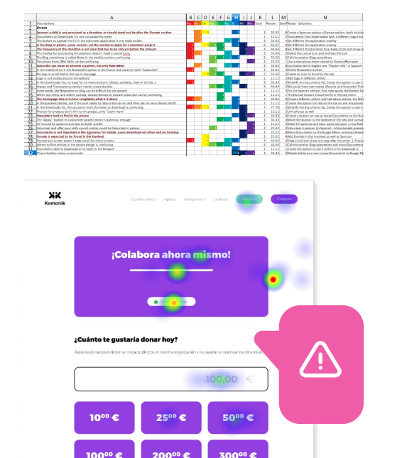
Severe problems with the sponsorship structure and the payment banner
We tested a mid-fidelity prototype with 9 moderated usability tests, which revealed big issues. For instance, our users didn’t want to see sponsoring and donations on the same page, they wanted them in different sections. Other severe errors were related to the wording or UI.
The second round, including the new branding and high-fidelity designs, had one main problem. Our plug-in for payments displayed a huge confusing banner that was blocking users from donating.
Read moreWelcome to Kemonïk!
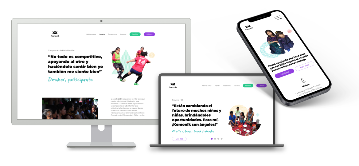
Lotta’s current experience is much more delightful!






Check it out!
 kemonik.org
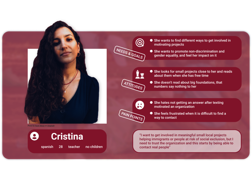
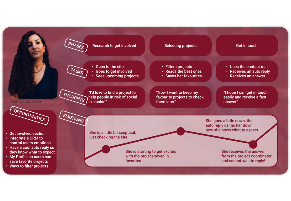
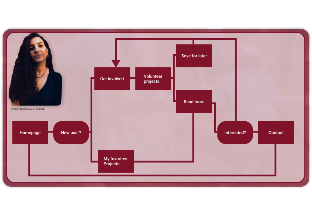
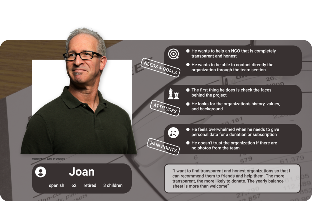
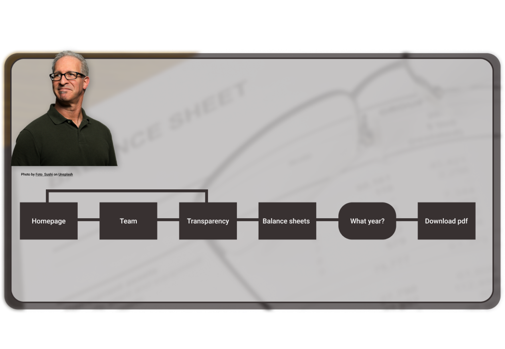
Future objectives: try to meet all our user types' needs
Besides creating a podcast, a blog for Pilar and polishing our current solution, we focus on including the extra 2 user types that we noted during the research. Most of our next steps will be reviewing and matching their needs. We plan to meet Cristina's expectations, with ways to get involved other than donating money, or Joan's needs, raising awarness for real transparency throughout the organization.